We updated California Home + Design's (CH+D) website to reflect their new look and feel, resulting in an 80% spike in visitor traffic
The back story
Sometimes the best business decision you can make is to change course completely. This is exactly what CH+D did when the company realized it was going after the wrong audience. Instead of trying to reach individual contractors and home decorators, they decided to focus on a smaller but more lucrative niche: high-end interior designers.
Connecting with this market meant CH+D had to update their magazine with a totally new look and feel.
CH+D turned to Chapter Three for a website that would reflect the magazine’s new branding.
Using CH+D’s print redesign as our starting point, we created a website where interior designers—and anyone who loves beautiful home décor—can find quality furnishings and catch up on the latest design trends. In a word, the new site is “stickier,” attracting more visitors and keeping them on the site longer.
As a result of the site upgrade, CH+D is not only positioned for significantly greater ad revenue—it’s also emerging as a leader in the luxury home décor space.
Digital brand extension

It was important to give CH+D’s website the same sophisticated look and feel of the redesigned magazine. Here’s what we did to make that happen:
- Emphasized the visual appeal of CH+D’s products, with a big, uncluttered product images
- Reorganized the navigation bar, making it easier for designers to find the products they need—or haven’t yet discovered
- Increased the prominence of the the newsletter subscription box to drive more sign-ups
- Implemented a typeface that closely matched the magazine’s new typography
- Updated the color of the CH+D logo to an eye-catching shade of pink
Improved user experience
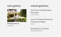
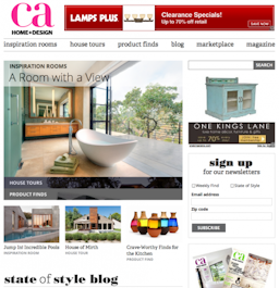
The new CH+D site encourages visitors to stay a while and enjoy themselves. You can browse without interruption as you go from one gallery to the next. The inspiration rooms, house tours and product finds pages also feature links to related content, for even more ideas.
Analytics prove the new CH+D website is catching—and keeping—people’s attention:
- 84% increase in pages viewed per visit
- 73% increase in time on site
- 80% increase in overall page views
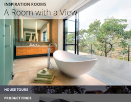
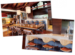
Images front and center
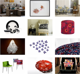
Great imagery gets people excited about their design options. That’s why we’ve saturated the CH+D website with compelling product photography.
Visitors are now greeted by a big, inviting image on the home page. With its gorgeous photographs of beautiful homes, the house tours section inspires us with new design possibilities. And our image-rich product pages make it much easier for designers to select the right pieces for their clients.
CH+D’s image carousels—a better way to view content
Whether in the inspiration rooms, the house tours section, or the product finds pages, visitors simply click from image to image, with the option, in some cases, of clicking through to the individual product manufacturer’s website to make a purchase.
No hassles, no distractions—just a great viewing experience for maximum inspiration.
Zoom functionality in carousels
We’re especially proud of what we call the “z-axis zoom slider.” By clicking on a highlighted box that appears in some images, visitors can zoom in on a detailed image of a particular product. It’s precisely the kind of up-close glimpse designers need in order to make purchasing decisions. And we think it looks pretty cool, too.
New typography
We chose clean, bold typefaces that really “pop,” making the site easier to navigate and, frankly, a lot more fun to look at. These new typefaces matched the ones implemented in the redesigned print publication, making for a seamless brand experience.
